
How Much Does A Law Firm Website Cost?
A law firm website is the most essential marketing tool to help grow your business. Your online presence is key to bringing in new potential clients. But, how much does a law firm website cost? And how do you determine how much you should budget for a website that checks off all your business needs?
This article will outline features that law firm websites should include. As you read through this post, the concepts will build upon each other become more detailed (and technical). My goal is for you to walk away from this article ready to dive into all those website quotes you received and help you pick the one with the most value for your law firm. So, how much does a law firm website cost?
What is the price range for legal websites?
A quality law firm website for a small to medium-sized practice will cost anywhere from $3,000 to $20,000. The final design cost of the website ultimately depends on its purpose. If you want a website that serves as the marketing hub for your business, the design, functionality, and user experience must be well thought out and properly implemented by your website developer and graphic designers.
A well-designed website can generate a significant return on investment (ROI) for your law firm, but the upfront investment is likely to be on the higher end of the range. Don't let the high prices discourage you from creating your first website or redesigning your existing site. You can have a high-functioning website without breaking the bank.
What Influences The Cost Of A New Law Firm Website?
The main factors that determine how much law firms spend on web design are:
- The number of web pages
- multi language support
- graphic design for logos, images, and icons
- videos
- professional photography
- custom functionality like filters for blog post categories
When working with a website design agency, make sure to have a strategy meeting to discuss all things you need your website to do for your law firm and don't pay for anything you don't need.
Graphic design for your law firm's website
Graphic design is integral to building a new modern website. Graphic designers make your website look appealing and professional. When people visit websites they judge the company based on what you show them, whether that’s through photos, graphics, or typography. If your site isn't visually pleasing, chances are the client will go looking at other law firms in your service area.
The graphic designers will greatly decrease the development time by providing a solid road map for the developer to follow. Most importantly though, hiring a talented designer will ensure that the final product matches your vision for your law firm's brand.
So what's the difference between graphic designers and website developers?
A good developer specializes in the computer code (HTML, CSS, and JavaScript) that goes into building and hosting your website. The web developer will also take time to ensure your website loads quickly and looks correct on mobile devices.

Graphic designers specialize in the artwork used to make your website look appealing. We always recommend working with a graphic designer when starting a new website project. Graphic design costs can generally range from $500 to $2500 dollars depending on the scope of the project.

Do you need your website in multiple languages?
Does your law firm offer services to clients who prefer a language other than English? If so, It is important to have your site translated into different languages so that you can reach your target audience. Many law firms will translate their entire site into two or three different languages. Without translation, you could miss new clients because they simply can't access the information.

Multi-language support is one area that can increase your law firm's website cost. But that cost will quickly be offset by an increase in revenue from non-English speaking clients.
A multi-language site will allow for:
- Easy site navigation with no language barriers.
- Greater SEO visibility, because keywords are translated into other languages.
- Increased customer conversion rates due to better clarity on products or services offered.
There are many different tools, methods, and processes to translate a website. If your site is built using WordPress, we recommend PolyLang because it is affordable, easy to use, and lets you control the translation.
What Other Things Can Add Additional Costs to Attorney Websites?
Professional photography, branding packages, software and marketing tools, and development time can all start to add up when building your website. We think all of these items are a worthwhile investment when building out your web presence. But, the list below are items you should definitely consult with your marketing agency when building your law firm's own website. If you have any questions about law firm marketing, make sure to check out our page to learn how to best market your law firm.
Site updates, content creation, and security patches
We talk about web design maintenance plans first in this section because it is very important to make sure your site is safe, secure, and up-to-date with relevant information. Attorney websites are not "set it and forget it" type of investments. Websites require ongoing maintenance such as monthly security patches, plugin updates, and simple page updates.
Most web design agencies offer monthly maintenance plans to make sure your site is running smoothly. A monthly maintenance plan should also include minor tweaks like updating existing page content, swapping out images, or changing current offers.
Maintenance plans cost around $100 to $300 dollars per month for basic updates and content tweaks. We offer hosting and maintenance packages so that you can focus on running your business!
If you are looking to aggressively bring in new traffic to your existing site, make sure to talk to your marketing firm about a search engine optimization (SEO) package. This type of monthly contract will focus on writing blog posts, optimizing your current pages for search engines, and building out new pages to target specific keyword searches that relate to your services.
Contact us form submissions, data management, and analysis
Contact forms are the most common way to get in touch with you. If you're running a law firm website, there's no better way for customers to reach out than by using your contact form. But, how is contact form data consumed and processed by your office staff?
Most free contact form plugins will send you an email that includes the information entered into the form. However, we believe that potential client lead data is invaluable and should be processed a bit more elegantly. One of the most simple solutions is to link your contact form with Google Sheets. We use Fluent Forms to help our agency track form submissions. The Google Sheets demo below was accomplished using Fluent Forms and Google Sheets integrations. You can check out their contact form tools here.
With Google Sheets integration, every form submission will populate into a spreadsheet automatically. All of the contact information will be compiled into one place for analysis. You can then delete contacts when you know that they are not interested in your services or flag leads that would like to schedule a consultation.
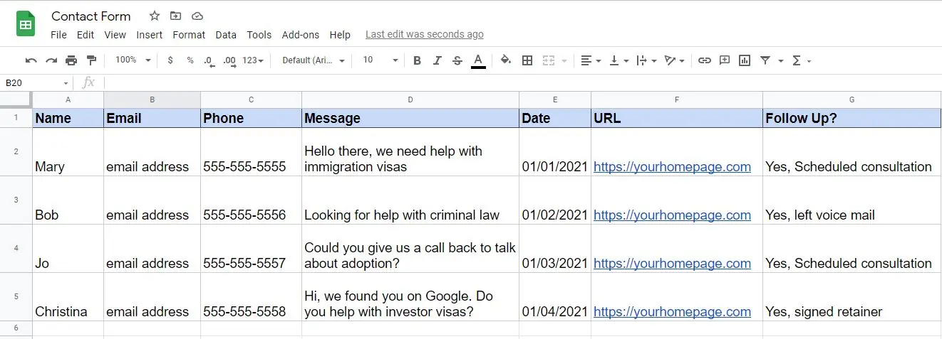
Tracking your leads will help you calculate your return on investment if you are working with a digital marketing agency, running SEO campaigns, or posting Google ads. You can also see which web pages or blog posts are generating the most traffic and what the conversion rate is for that specific page.
So, make sure to discuss contact us forms when you are consulting with a website agency!
Where Should You Definitely Spend Money When Scoping A New Website?
Law firms use their website to communicate how their practice will help potential clients. To do this, you need a design that's both attractive and easy to navigate. Effective navigation is key to helping visitors find the information they're seeking quickly.
"Call to action" sections should be strategically placed to help guide the person on what you what them to do. In this section, we will dive into the key components that your law firm website should include. We believe that any money invested in graphic design, user experience, website structure, and navigation is all worth it.
Graphic design
Working with an experienced graphic design team will make your website pop and showcase your firm's work. A designer will greatly speed up the website project because graphic design software is flexible and revisions can be made quickly. The same can't be said for the website developer. It is much more difficult to design a website using website development tools because a lot of the work is hard-coded.
Having that expert graphic designer's eye is the way to go, trust us! Graphic designers are artists and excel at their specialties. If you have any questions about how to find the right designer, don't hesitate to contact us.
Menu navigation
The website menu is best situated at the top of each website page. It is the primary navigation landmark that guides users around your website. Your menu design should be intuitive and well organized. You can't always include every service that you offer within the navigation menu. Try to include at least the following menu elements to help users navigate your site:
- drop-down showing your services
- link to the contact information page
- link to your blog page
- link to an "about us" page
- home page link (or use your company logo as a link back to the home page)
- links to payment portals
- links for multi-lingual functionality
Category pages
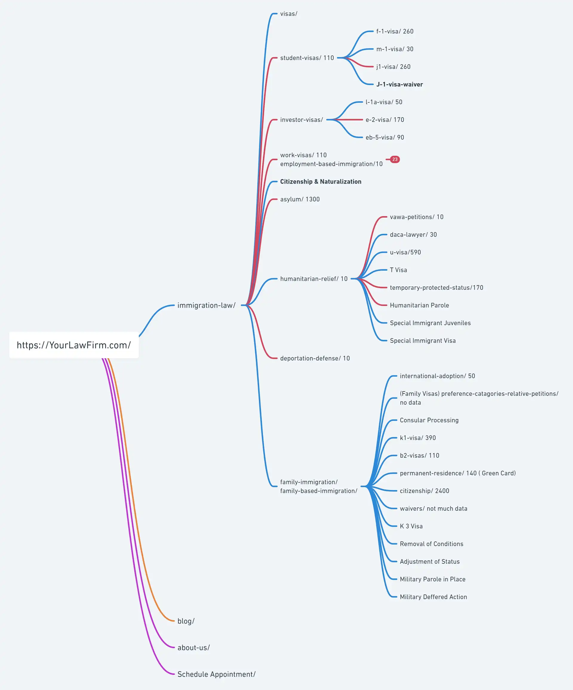
Together with the client relations manager at Shoreline Immigration, I designed and developed a website hierarchy to optimally categorize all of the immigration visas that the firm wanted to promote. We reviewed other law firms in the area to see how their sites were structured and tried to build a more competitive website. We also added filtering and sorting functionality to help users better navigate the company blog page.
Work visas and family visas made up for almost 30 pages of their website! It would be very cluttered to try and cram that many elements into the menu. Instead, we developed specific category pages for employment-based immigration and family immigration that stored links to all of the visas the firm wanted to target in their local market.
This decision pushed the website page count up significantly. We also had to spend time writing content for all of these pages, find photographs and imagery, and work with graphic designers for icons and other artwork.
So was it worth it? Absolutely! It is always better to build individual pages for your services because you can target specific keyword terms that potential clients are searching for on Google. It is much easier to rank a page for one or two keywords than for many keywords.
Looking at the family-based immigration services example, it would be difficult to rank one website page for the 7 different visa services the firm offers. Instead, we can specifically target Fiance and K1 visa searches on Google with their own dedicated page.
The website structure
The structure of your attorney website is very important for SEO. Search engines look at the "tree" of all pages on a website to determine how authoritative and relevant each page is when ranking them in their search engine results. If you have an unorganized tree, or if you don't include keywords that target specific markets, then Google will struggle to index your site properly.
Sitemaps speed up the development process
We recommend developing a sitemap when designing the architecture of your new site. It will provide you and your web developer with an accurate representation of how all pages are linked together. Sitemaps are also used by search engines for indexing purposes.
Call to action (CTA) elements
Users will quickly know if they want to contact you or look elsewhere for legal services. Make it easy on potential clients and place contact forms and phone call prompts after each significant website section. You can overdo it with the CTAs. Be sure to discuss CTAs with your website developer and think about where to prompt the user to submit that contact us form.
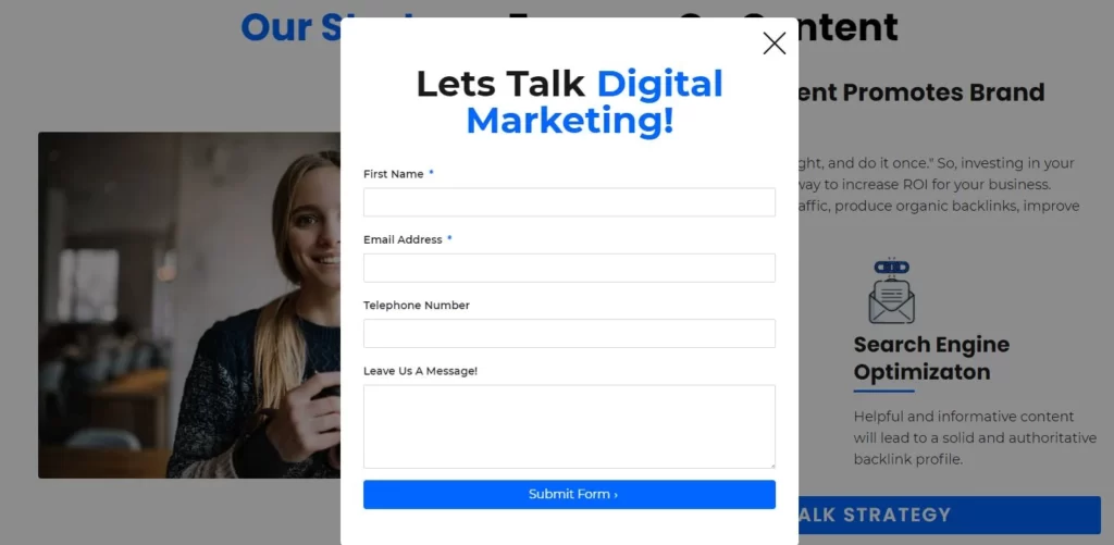
Call to action elements can be something simple a button with a text that says "Schedule a Consultation", or you can get fancy and include pop-ups that prompt the user to submit a contact form if they start to leave the page.
Here is an example from our homepage where we have a section discussing our strategy:

When the user clicks on the button, a contact us form popup (aka a modal) will come into view promoting the user to submit a form. We like this approach because it doesn't re-direct the user to a new contact us page. Instead, the user can stay on the same page and keep browsing its content.
Mobile Responsive Design
When building a legal website, the developer has to make sure your site looks great on desktop computers, tablets, and mobile phones. The best website design firms pay close attention to the website's responsive styles. The work responsive in website development means how well the website display on different screen sizes. As screen size shrinks, it becomes more challenging to fit all the images, graphics, and text into the available space. Webpages that look defective, messy, or incomplete on mobile devices will turn clients away.
Your web designer must deliver a mobile responsive website. When consulting with a potential website design firm, make sure to ask questions about mobile responsiveness and inform them that you will be checking the website on smaller screens.
These two examples show how different sections will look on desktop and mobile screens. With desktop computers, the web developer has a lot of screen real-estate.
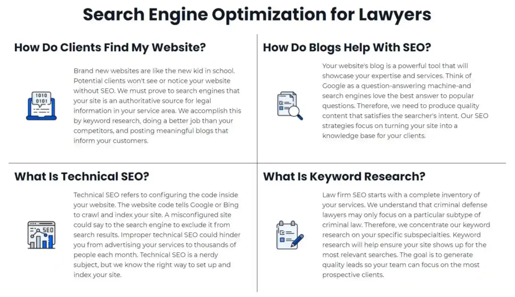
On cell phones, the screen size shrinks and the design must respond accordingly. Any reputable marketing and website design firm will know how to design your site to look as best as it can on a mobile phone.
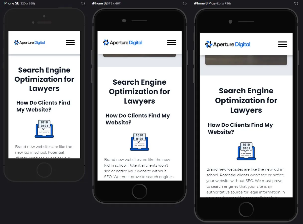
Will all designs look the same on desktop and mobile?
It is important to note that a really catchy design on a desktop screen might not work out on mobile phones. Again, this is why graphic designers are so pivotal in the website design process. They can design multiple layouts to help display your law firm's new website on all devices!
How Much Does A Law Firm Website Cost? Our Final Thoughts.
We understand that when it comes to marketing, you want a high-quality website design, the best possible customer experience, and to keep the project costs reasonable. Law firm website cost is an important consideration when scoping a new project. Make sure you budget for graphic design, development time for site structure and navigation, and for a great user experience.
Once you have a good idea about what you need from your particular website, you can review quotes from the design agencies with confidence. That's why we've created this blog post with tips on how to budget for graphic design and web development services so that your new site is just as professional as your practice! If you're looking for more information or would like some help deciding on the right strategy, please visit our contact page or call our team at (216) 264-9114 anytime between 8am - 5pm EST Monday-Friday.
Frequently Asked Questions
How much does a law firm website cost?
What is the most important part of a legal website?
What features increase the price of my website?
Is a graphics designer required to build a website?
Table of Contents
