
[rank_math_breadcrumb]
October 21, 2021
10 Tips to Improve a Law Firm Website
Law firm websites should be designed with care and consideration because the success of your site relies on the proper aesthetics. In this post, we will discuss 10 tips that will improve your website's conversion rate so you can consult with more prospective clients.
These tips will be organized into the following categories:
- Appealing website design and working with graphics designers
- Writing a clear message for your viewers
- User experience while visiting your law firm's website
Let's get started learning 10 tips to improve my law firm website!
How Website Design Will Help Convert Potential Clients
Tip 1 - Focus on the Aesthetics
Take a hard look at your website and ask yourself "Is my website pleasant to view?" If you don't answer with an unequivocal "YES!" then you could be losing out on potential clients simply because they don't feel excited or engaged while browsing your site.
That being said, your website is the face of your business and a powerful online marketing tool. Your website should present your law firm in a manner that puts the customer at ease while they learn about your services. A clean, well-organized site will give off good vibes. People will trust what they are reading while browsing, which should lead to more retainers signed.
Pro Tip - Hire a graphic designer if you are planning to build a new website or are thinking about refreshing your current website. If you are researching how much a law firm website should cost, check out this post that covers just that topic.
Graphics and custom artwork will make your law firm website more memorable, personable, and trustworthy. A graphic designer will create mock-ups of your website and work with you on revisions. They dial in the design just like you see it in your head. It is much easier to revise a website mock up than to have your web developer try to implement a major graphics change. It is very important to have the designs flushed out prior to moving forward to the development phase of a website build.
Furthermore, a professional web design will tap into those emotions that instill trust in your business. Paying a little extra for the right images and graphics will turn a boring website into something much different: a lead-generating sales funnel that brings organic traffic to your business 24/7.
Pro Tip - Use white space when you want users to find something specific on your page.
Keep each section of your web page clean and precise. Try not to clutter sections without too many icons, images, or excessive text. Keep it simple to drive home your selling points.
So what's the big deal with white space? White space allows the eyes to rest and focus on exactly where you intended. The goal is to design each website section with a specific intent and to utilize the space as effectively as possible. This is where graphic design can really come into play to help polish your law firm website.
Tip 2 - Plan out the layout for your law firm website with your designer
The website layout is the overall design structure and organization of your main pages. Web pages are broken down from top to bottom and generally include:
- a header that contains your logo and navigation menu
- a hero section
- the product and service sections
- the call to action sections
- a "contact us" form
- a sidebar (if applicable for your website)
- the footer
Header and Hero Sections
The header section can consist of one or two rows (or three if you really need a lot of space). You can add items like promotions or upcoming events on the top row of the header. The primary row of the header consists of your logo and main website navigation elements.
The hero section is the first thing the user sees when landing on any page of your website. The purpose of a hero section is to highlight the page content. Law firm websites benefit from eye-catching hero designs because they immediately engage the user upon viewing the web page. We recommend placing a CTA element inside the hero section. Law firms can use CTA elements to prompt the user to take specific action immediately. This could be signing up for a newsletter, filling out a contact form, or calling your office directly.
After reviewing the hero section, the user knows what the page is about and is ready to explore your law firm services section. We believe that your services should be prominently displayed close to the top of the page.
Service Sections
Your law firm's service section should be clear and concise. A major pitfall for law firms is trying to cram too many services onto the home page or into a single section. To ensure that you don't fall into this trap, rank your services based on what is most important to your business.
Next, strategically place the most important services where users can easily find them. If you offer a variety of services, we recommend categorizing them and building unique pages for each service category. Categorization may or may not be necessary: it all depends on your law firm's areas of expertise.
Call to Action Sections
We will cover this topic in more detail below, but here is a quick summary:
CTA sections can follow a service section. The goal of a CTA is to prompt the user to contact you to schedule a consultation. If prospective clients like what they see and read, a powerful CTA can push them to contact your office. And that is the exact purpose of your law firm website - generating more leads.
Take a few minutes to browse competitor law firms to see what type of CTA elements they have implemented, and pass your favorite CTAs on to your digital marketing agency.
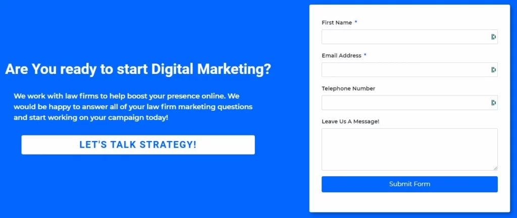
"Contact Us" Forms
A "contact us" form is a great way for prospective clients to submit their contact information. We suggest that your contact form should only contain fields that are absolutely necessary. With most contact form plugins, you can set the fields as required or optional. New clients may be hesitant to include their phone number or other sensitive data in the early stages of their research, so maybe an email address is good enough.
Fields to consider on your contact form are:
- Name
- Phone number
- Email address
- Descriptive message
You can read more about contact form length and success rates at How Does Form Length Affect Your Conversion Rate | Mailmunch.
Tip 3 - Easy navigation will help users find their way around your site
Visitors to your website should easily find what they are looking for. It must be easy to find the navigation menu, and link titles should clearly identify where the link will lead.
Add a navigation bar inside your header. This bar can contain links to all of your most important pages (e.g. home, about us, contact, services, etc.). Make sure that you include an obvious link back to your homepage so users can quickly navigate back when needed. Use explanatory text on each link rather than just icons or "read more" labels. This allows people who are using assistive technology, such as screen readers or voice recognition, to better understand where the link will take them.
Law firm websites with poorly designed navigation and menus risk losing prospective clients. If the user finds it difficult to navigate your site, they will leave. Your competition may have invested a little extra on their website and that could be the deciding factor for the client.
Make sure you don't pack your menu drop-downs with too many links to other pages. If you are an immigration law firm, you don't want to add every visa type you offer to your menu - an exhaustive list may be overwhelming to visitors. It would make more sense to the user if you divide your services into categories.
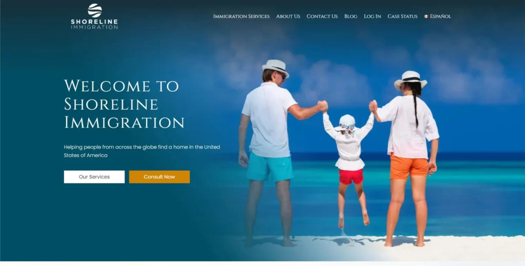
Let's look at immigration services as an example:
The menu that Aperture Digital designed for the law firm, Shoreline Immigration, had a drop-down for immigration services. Inside the drop-down, we listed out the core business service sections. You could add additional drop-downs that emerge when the user hovers over a service heading, but we chose to build out specific pages for each service. Search engines prefer when there is a clear hierarchy and relationship for your web pages. This hierarchy explains to the search engine how all the different pages fit together.
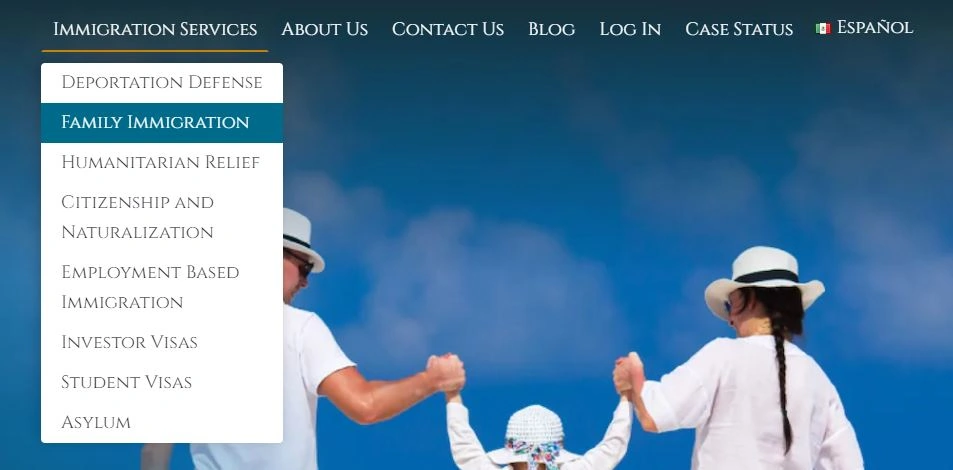
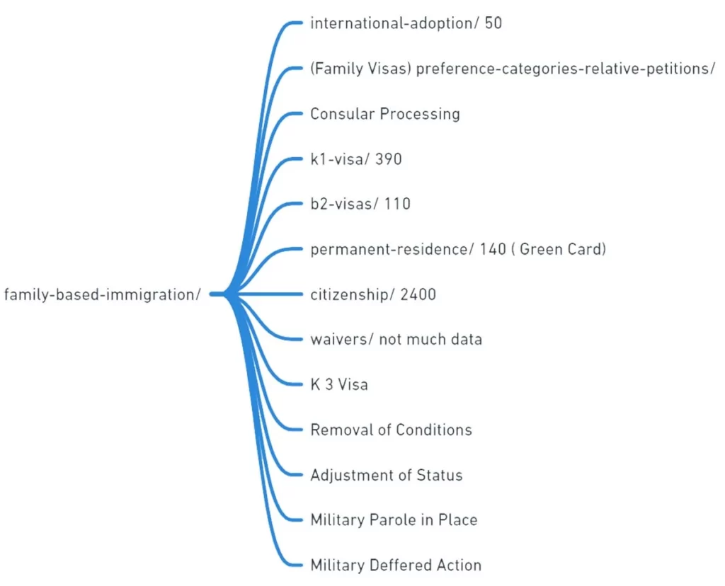
Family immigration and employment-based immigration pages served as category pages. These pages stored all the various visa types for that particular law firm service. They were not included in the main navigation menu on the home page because there were so many different linking pages that the menu would become cluttered.
The user then could follow a link for each visa of interest and explore that specific visa on its own page. The image below details how we decided to layout the site navigation structure to best capitalize on search engine optimization.
How to write content for your target audience
The message, wording, and section headings for your website directly represent who you are as a company. When writing website copy, always keep your potential clients in mind. Would this appeal to them? Would they be able to easily find the information that they need?
Tip 4 - Use Engaging Headlines to help users know what your page is about
A website heading indicates the topic of the page and each individual section. They are usually in bold font and guide the user through the content.
Headings are tagged with HTML code to help search engines understand explicitly the topic of the page. There are 6 heading levels, h1 through h6.
The h1 tag is the most important and it denotes the topic of each specific page. It can only be used once so make it accurately reflects what the webpage is about.
Pro Tip - In the h1 tag, incorporate keyword terms that are frequently searched. The keyword should be hyper-specific to your local audience. Carefully planning your h1 tags will help SEO optimize each of your pages and attract the right audience to your website.
Example of headings in action
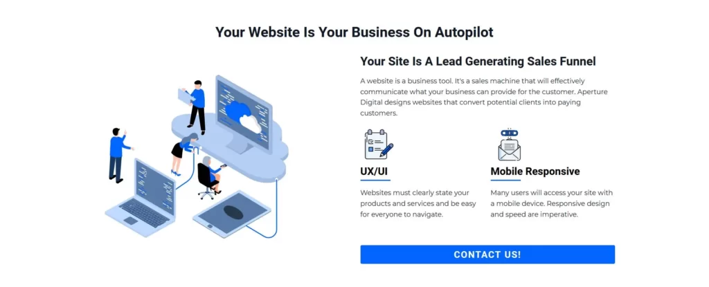
In the image below, the section has an h2 heading tag to talk about how websites are working for you 24 hours a day.
The other three headings are h3 tags and they are used to call out what each paragraph is going to discuss in more detail. Many users skim web pages. Therefore, headings can help catch their attention and draw them into the content you want them to engage with.
5.Write content (AKA copy) with a goal in mind
When building out your website or writing blogs, make sure you have a clear goal in mind for every page's heading, copy, and images.
The goal of any copy should be to tell people what they want to know about your service and show them why you are a great law firm. Your customers are not lawyers, so write in a way that's easy for them to understand and act upon.
Try to avoid complicated, formal language and steer clear of legal-speak as much as possible. If your website is overly complicated for the average person, that could steer them away from a competitor in the area. Always try to put yourself in the customer's shoes. When they are seeking legal counsel, they may be going through a tough time in life. Avoid adding to the stress of their situation by ensuring that your website is approachable and client-friendly.
6. Write for your law firm's specific clientele
Whether you specialize in one type of law or practice in multiple specialties, your website should have dedicated pages for each type of law you practice. Separating your services into multiple pages will allow you to customize your website copy to a very specific audience.
For example, if someone is looking for legal advice about divorce law, your content should be written with the grieving party in mind. You don't want to miss out on a potential client because your website seemed aggressive, cold, or insensitive, or spammed with unnecessary popups.
The takeaway point here is to spend a little extra time thinking about the words that you choose to use on your specific service pages. Depending on the service, you may want to sound empathetic, aggressive, or any other type of emotion. Tapping into the real-life feelings and struggles of average Americans may be just the key to writing excellent website copy.
7.Research your competition and do a better job informing your users
Competitor research is an SEO strategy that all marketing agencies use. Go to Google and type in a keyword for your specific law firm's practice type. Something like "Divorce Lawyer Cleveland" (make sure to replace the city with your own) will show your top competitors that are ranking highly on Google.
Next, study the competitor's service pages. The law firms that are ranking on the first page of Google are doing something right and can give you ideas on how to provide a better experience to people visiting your site.
Don't plagiarize their text and copy/paste it to your site. That will not help your law firm rank higher on search engines. Instead, try to see if there is an information gap or something you could write better than your competitor.
If you follow all the steps in this section, your law firm should expect to see higher search engine rankings and start to generate business.
Pro Tip - If you aren't writing blog posts about all the different services you offer, try to publish at least one blog a month. Make sure to write about why people need your services and always write to inform and help the client. We like to publish more than once a month, but any useful website content will help to grow your online presence!
Capitalize on User Experience, Site Speed, and the User Interface
8. Create an intuitive interface on mobile and desktop devices
Creating a website that helps users easily find what they need is essential for any law firm. We have touched on the structure of a website and all the important pieces your site should contain. We also reviewed site navigation and site structure/site mapping. Now, let's discuss how to display this information to create an enjoyable experience for your visitors.
Aperture Digital implemented a "fixed" mobile menu for our partners over at Shoreline Immigration.

The menu is fixed to the bottom of the screen and is always in view. This makes it very easy to contact the law firm's office without having to scroll around for a click to call or find the submission button. We also implemented a language switcher to toggle the site from English to Spanish. The user has all the controls at their fingertips so they can consume the information on the page as effortlessly as possible.
Client controls implemented in this fixed menu:
- Menu button to pop out the mobile menu
- Language toggle to Spanish
- Click-to-call button prominent in the center
- Contact form submission button
- User login link
Design Principals that will help user experience while on your site
Although there is no hard and fast rule for what constitutes a good user interface, some design principles can be applied across the board. For example, one of the most common ways that websites fail their users is with cluttered or unreadable text. Text that is too small to read has poor contrast with the background color, or overlapping text elements can be a genuine problem for your users. In addition, text that requires scrolling vertically or horizontally will often frustrate people who are trying to use your site on phones and tablets.
Personally, I find text that has poor contrast with the background color highly frustrating. White text on a yellow background is almost impossible to read.
I know we mentioned graphic design several times already, but details like your site's font color and background colors can make or break the user experience on your website. So, hold those graphic designers accountable and make sure everything is in order when designing your fonts and colors!
User Experience and SEO
Does user experience matter for SEO? The answer is absolutely! Proper design elements are reviewed by search engines and flagged if there is a problem that could result in poor usability.
For example, Google will flag your web pages that fail mobile usability tests where:
- Text is too small to read
- Clickable elements are placed too close to each other
- Content is wider than the screen size (content overflows the screen)
Consistency is key
Users want consistency when browsing a website. Consistency helps users feel more comfortable with where they are on your site and keeps them engaged with your content longer.
Do's and Don'ts
- DO use consistent fonts for headings and text.
- DO use consistent colors for call-to-action buttons, hyperlinks, or other significant elements on your site.
- DO use a consistent structure for your home page and service pages.
- DO use headings or bolded font for important blocks and sections.
- DON'T add huge images that take a long time to load. Optimize those images using Squoosh!
- DON'T use popups every 10 seconds. If you need pop-ups, use them strategically.
- DON'T write content that is overly promotional. Remember, good websites help people with a problem!
- DON'T hide text where users must horizontally scroll. Keep everything in clear view.
9. Create a clear call to action to tell the user what you want them to do
When people are searching for a lawyer online, finding the right lawyer and then quickly getting in touch with them can be difficult. That is where "call to action" (CTA) elements and sections come into play. These design elements will help prompt the user to take a specific action.
Many law firms are not equipped with a website that has online chat, contact forms, or a tap-to-call button on mobile. An easy-to-use website will have all the above contact elements prominently displayed throughout all pages of the website.
Here are two examples of CTA sections on our website. The first image has a button that takes you to our contact page. The second example has a contact form inside the section or a button link. We like to test which version works best at converting leads. If one example works better than the other, we will update our site accordingly to have the best converting CTAs on all of our pages
Version A:

Version B:
Here is a list of CTA elements:
- "contact us" form
- click to call buttons
- newsletter sign up forms
- exit intent popups
- scroll triggered popups
You should place a CTA element:
- in the hero section of every page
- after a key service offering - typically close to the top
- in the footer of your website
- after long blocks of text
Make sure your CTA elements contain action words and phrases that clearly prompt the user to do something.
Some examples of action phrases for your CTA elements could be:
- contact us today
- schedule a call
- learn more about {your service}
- schedule a consultation
- let's have a conversation
- let's chat
There is no point in having a website if your user can't easily get in touch with you or learn more about your services. When working with a web design agency, take some time to talk through your CTA elements and brainstorm some unique ways to give back to the customer. Maybe an e-book or newsletter could be the deciding factor to hire your law firm today!
10. Optimize your website so it loads quickly on mobile and desktop devices
(Warning! This is a bit techy and nerdy. But, it's important!)
Users expect websites to load quickly, especially mobile users. If your website takes too long to load, they will move on to one of your competitors.
Here are 5 tips to help speed up your website today:
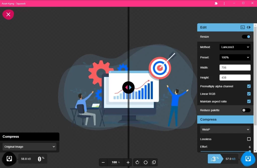
- Optimize your images using an app like Squoosh and try to keep the file size between 50-75 kilobytes.
- Lazy load images so that the resource doesn't load until the user scrolls to that section of the webpage.
- Make sure you are caching your website. Talk to your web host to see if they offer server-level caching.
- Optimize your JavaScript and CSS file by minifying and combining them
- Defer non-essential JavaScript files so they load after the webpage has fully rendered
Check out this image of Squoosh in action. I like it because it quickly gets the job done re-sizing and converting images to different formats. Plus, it has the ability to export in WEBP format. WEBP image types are compressed images that retain an incredible amount of detail. Please note, not all browsers can display WEBP images. if you choose to use WEBP images, make sure you check out which browsers can display them. Most modern browsers display WEBP formats.
There are many web professionals that can help you speed up your law firm website by optimizing images, configuring caching and speed optimization plugins, or building a website using tools that don't produce unneeded code. Google rewards sites that load quickly and are optimized for mobile devices.
The end goal of any website is to serve helpful content and provide a satisfying user experience. If your site doesn’t have the features, content, or design aesthetics that keep users engaged, you are missing out on potential customers and revenue. To learn more about other law firm marketing tips, visit our law blog at Law Firm Marketing | Aperture Digital Marketing
If you are interested in talking to us about web design and SEO services, please don't hesitate to drop us a note or give us a call!
Thanks for reading about ways to improve your law firm website!
Table of Contents